.jpg)
Customizing Color and Logo
1. Log in to the Admin Backend
Start by signing in to your Admin Dashboard.
Only admin users have access to branding and personalization options.
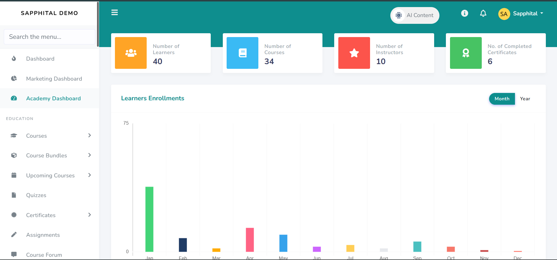
2. Go to General Settings
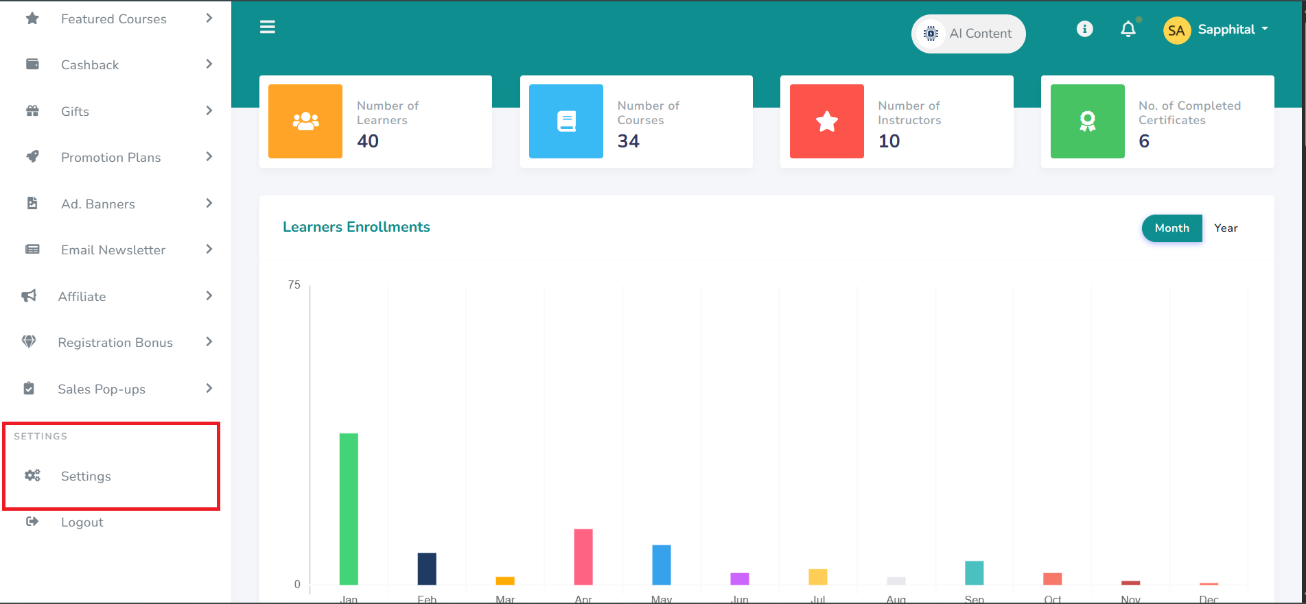
From the left-hand menu, click on Settings.
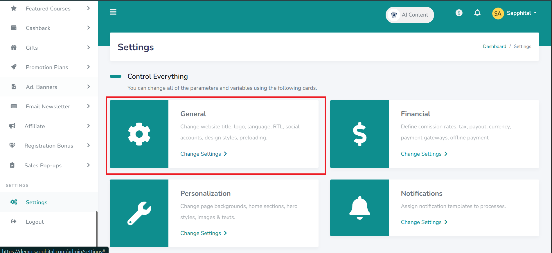
Then select General Settings.
This section manages your LMS’s overall identity including the website title, logo, footer logo, and default system language.
3. Add Branding Elements
Inside General Settings, you’ll find the following options:
Platform Title – The name that appears in the browser tab and system headers.
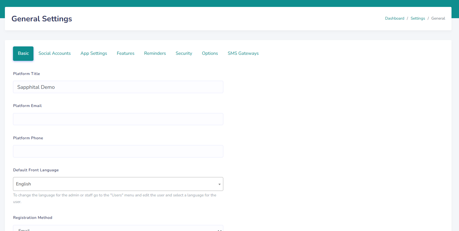
Scroll Down, Till You See
Logo – The main image shown at the top of your website and on login screens.
Footer Logo – The logo that appears at the bottom of all pages.
Favicon – The small icon that displays on your browser tab beside your title.
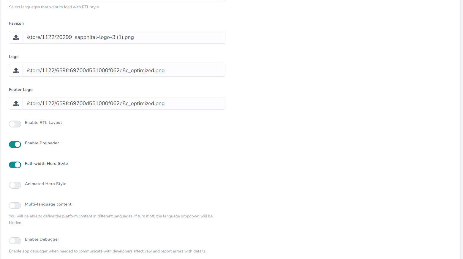
Make sure to upload clear, high-resolution images for best results.
4. Connect Your Social Media
Scroll further down and you’ll see fields for Social Accounts.
These allow you to link your organization’s official social media pages.
When added, the icons for these platforms (e.g., Facebook, LinkedIn, Instagram, YouTube) will appear in your site’s footer or contact sections helping learners find and connect with your brand easily.
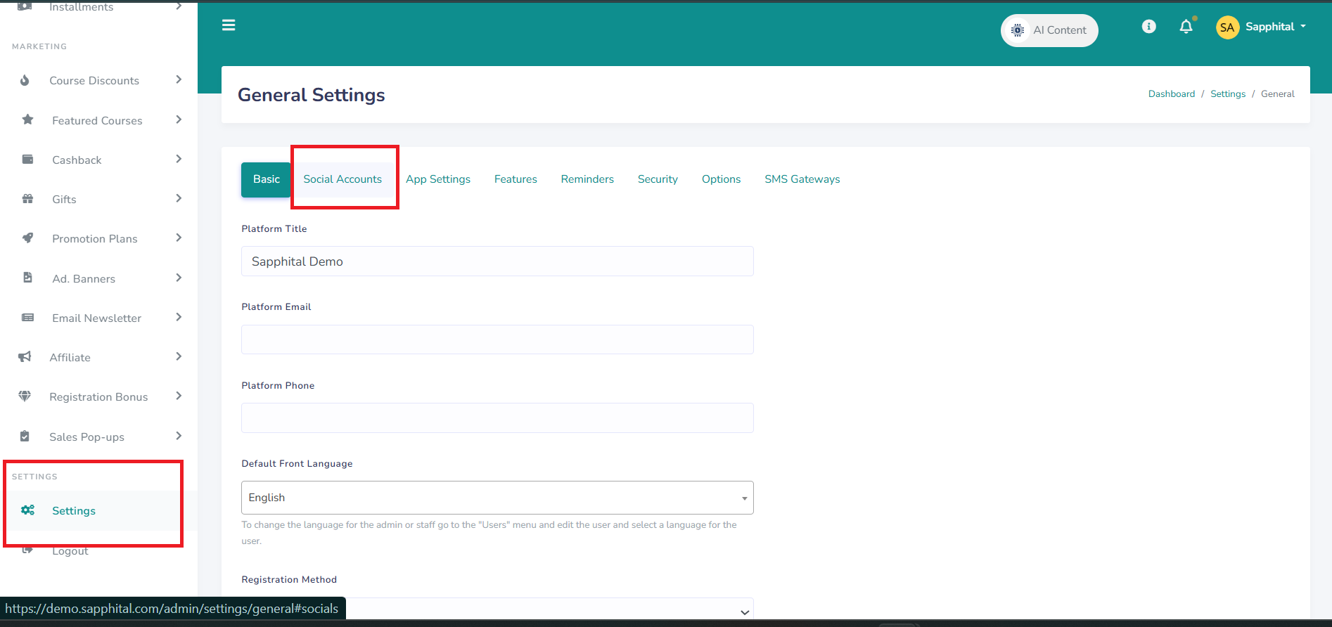
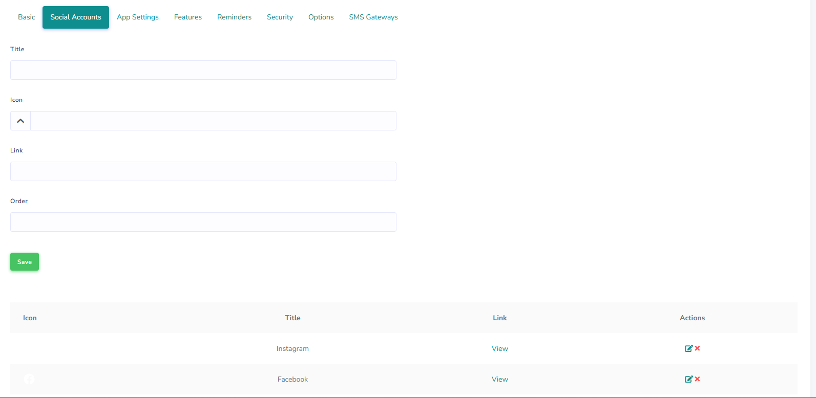
To upload your, Simply enter the title (eg Whatsapp, Facebook), Then upload the icon and then enter your profile's link
Choose the order in which you want the medium to appear (First, Second or Third) and then click "Save"
These allow you to link your organization’s official social media pages.
When added, the icons for these platforms (e.g., Facebook, LinkedIn, Instagram, YouTube) will appear in your site’s footer or contact sections — helping learners find and connect
5. Customize Your Colors
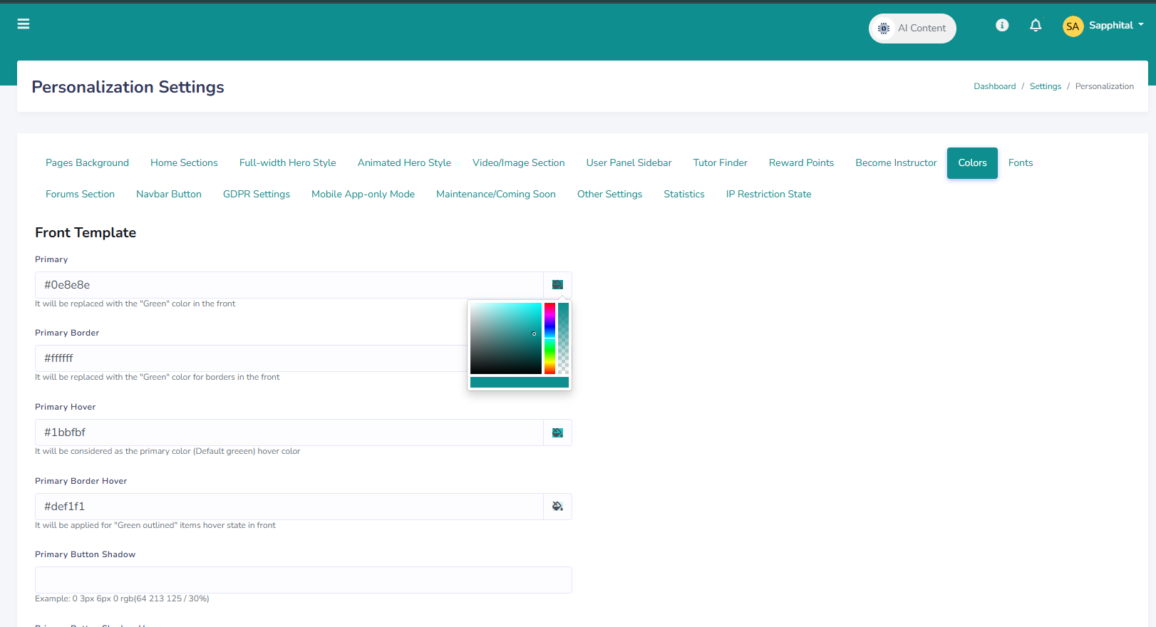
After finishing your basic branding setup, navigate to Settings → Personalization → Colors.
Understanding Color Options
When customizing colors in this section, you’ll find several fields under both the Primary and Secondary categories. These control how your LMS looks on the front end.
The Primary and Secondary options define the base colors of your system theme. The primary color is your main highlight — used for buttons, links, and key interface accents — while the secondary color provides a complementary tone used across alternate elements.
The Border setting controls the color of outlines and borders throughout the platform. Hover determines the color that appears when users hover over clickable items such as buttons or links, and Border Hover adjusts the border color during that same hover action.
Button Shadow adds a soft shadow behind buttons to give them a bit of depth, while Button Shadow Hover defines how that shadow changes when a user hovers over a button. The Button Color setting determines the main color of the button itself (either background or text), and Button Color Hover changes how the button appears when hovered — usually as a lighter or darker variation of the main tone.
Finally, Front Body Background controls the overall background color of your LMS interface, shaping its overall feel. You can enter colors using HEX values (for example, #0e8e8e) or use the built-in color picker to select them visually.
6. Save and Refresh
Once you’re satisfied with your logo, social links, and color setup: Click Save Changes.
Thn refresh the system (or clear your browser cache) to see your new design live.Comments (0)

Categories
Recent posts
Customizing Colors and Logo
5 Nov 2025.jpg)
Using the Noticeboard and Notifications
6 Nov 2025
Enrolling Learners in the LMS
6 Nov 2025.jpg)